The short definition
A floral phone case is shaped as much by negative space, direction and color restraint as by the flowers themselves. Open background makes blooms feel lighter. A diagonal or vertical arrangement creates movement. A limited palette turns petals into a stronger graphic pattern. Choose the compositional rule that fits your visual habits, then make sure its most important detail survives the camera opening.
Do not start by asking which flower is prettiest
Product names naturally send you toward roses, lilies or cherry blossoms, but flower species is a weak predictor of how a case will feel in your hand. A rose can be tiny and quiet, densely romantic or reduced to a black silhouette. The useful first question is where the eye gets to rest. Look at the amount of visible background, the route your eye takes through the artwork and the number of colors competing for attention.
This approach also makes online comparison easier. Instead of trying to imagine whether a floral style is “you,” reduce each design to a sentence: flowers framing open space, flowers moving in one strong band, or flowers filling the case in two colors. Those sentences describe how the case will behave beside clothing, a bag and the phone's own camera block.
Open space: let the phone participate in the design
The Cherry Blossom MagSafe design places pink flowers mainly along the lower edge and right side, leaving a large open center around the visible magnetic ring. The blooms vary in size, but they do not form a complete border. That gap matters: it lets the underlying phone color and the ring become part of the composition rather than accidental interruptions.
An open floral layout is useful when you like decoration but still want the case to breathe. It can also make a concentrated group of flowers feel more noticeable because the eye is not asked to process petals everywhere. Before choosing it, look at the exact phone color shown through the case and the camera shape for your model. Open space reveals more of both, so they affect the final palette more than they would under a full-field print.
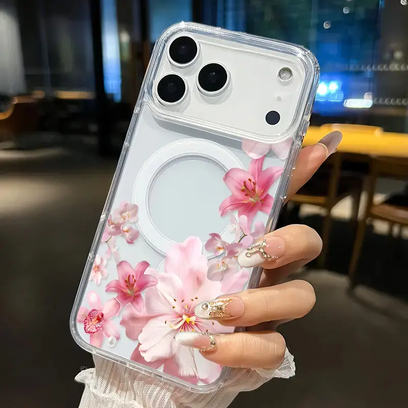
Cherry Blossom MagSafe Phone Case
Pink blooms gather around the lower and right edges while the open center keeps the phone and magnetic ring visible.
View product details →Directional flowers: choose movement instead of symmetry
The Rose Bouquet Cascade concentrates red, blush and pale pink flowers in a dense band that travels from the lower edge toward the upper-right corner. Loose petals soften the boundary of that band, but the movement remains clear. Your eye enters low, follows the bouquet upward and understands the case as one continuous gesture.
This is a better fit when you want the floral artwork to lead. The diagonal gives a crowded bouquet structure, so it feels deliberate rather than evenly scattered. It also works with the camera block instead of pretending that corner is not there: the floral band can continue beside it while a quieter field balances the opposite side. When comparing model previews, make sure the camera does not interrupt the narrowest point of the visual route. A few cropped petals are flexible; the main line of the bouquet is not.
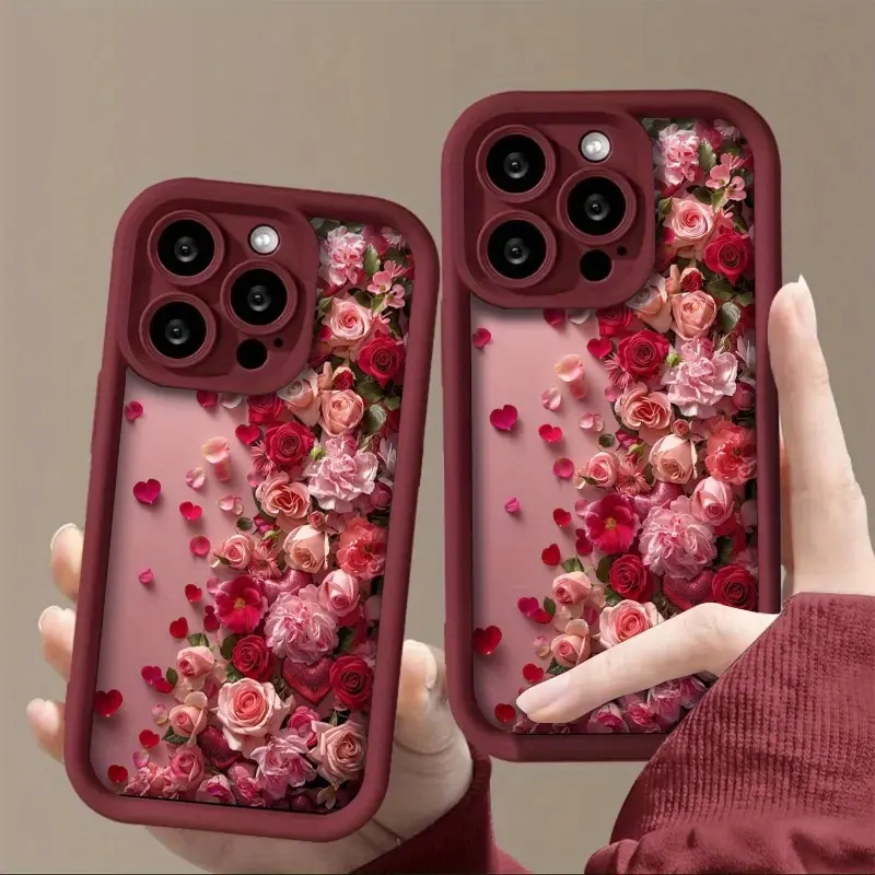
Rose Bouquet Cascade Phone Case
A concentrated rose band creates a strong lower-to-upper direction, with loose petals easing the transition into open space.
View product details →Limited color: let flower shapes behave like graphic marks
The Black Ink Flower design removes most natural flower color. Large black silhouettes sit over a pale marbled ground, with fine light lines tracing parts of the leaves and petals. From a distance, the first impression is black-and-cream contrast. The floral identity arrives a moment later, through the uneven curves and overlapping forms.
A limited palette makes sense when you want floral imagery without asking the case to coordinate several pinks, greens or botanical tones. It can sit beside more color because its own color decision is already settled. It is not automatically quieter, though. Large black shapes create strong contrast and remain visible at arm's length. Treat monochrome as a color strategy, not a guarantee of minimalism.
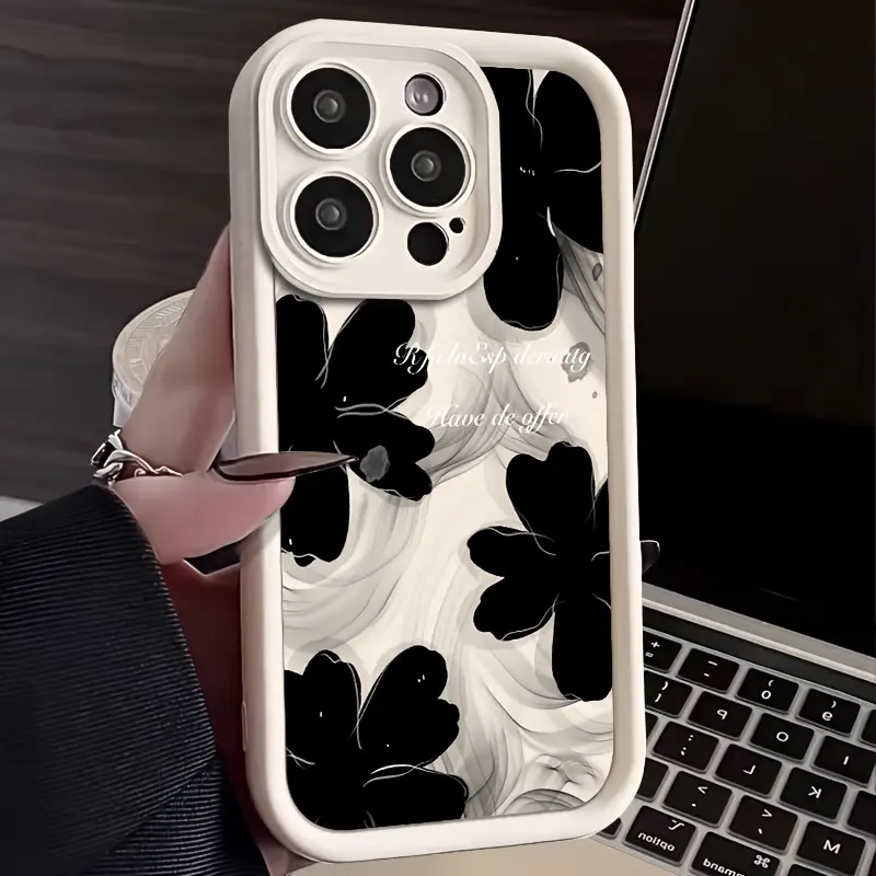
Black Ink Flower Phone Case
Oversized black blooms and a pale ground turn botanical forms into a bold two-tone graphic.
View product details →Use the camera corner as an editing test
A phone case is not a rectangular art print. The camera opening removes a different amount of space depending on the device, and it usually claims one of the composition's most visually sensitive corners. Good floral artwork has something expendable there: open background, the edge of a petal or a repeating texture. It should not depend on one complete flower sitting exactly where the lenses need to go.
Open the product detail for your chosen design and confirm the available model before checkout. Compare where the dominant bloom, the directional band or the highest-contrast shape sits. If you are thinking about scale as well as placement, the phone case pattern-scale guide explains why one large subject and a small repeat react differently to camera removal.
Pair visual weight, not flower names
You do not need a floral dress to carry a floral case. Pair by visual weight. A dense rose cascade can be the main pattern beside a solid sweatshirt, denim jacket or simple bag. An open pink arrangement can echo one small accessory color without matching an entire outfit. A black floral can repeat dark shoes or hardware while leaving room for a colored layer elsewhere.
If you do combine patterns, change the scale. A large black bloom can sit beside a narrow stripe more comfortably than beside another large botanical print. A detailed bouquet has an easier conversation with a broad color block than with equally detailed lace. For darker floral language, the gothic phone case guide separates romantic linework from louder contrast. The full Ocean & Nature edit lets you compare floral layouts beyond these three examples.
A practical three-step choice
First, decide how much background you want to see: a lot, a little or almost none. Second, trace the artwork with your eye. If it moves in a clear direction, check that the camera leaves that route intact. If it fills the case, check whether its color range is something you want beside your daily clothes. Third, shrink the product image to roughly phone size. The composition should still read before you inspect individual petals.
Then verify the exact product page rather than assuming every floral case shares the same model range or features. CasePop's current catalog pages are the place to confirm the selectable phone models, displayed options and checkout details for each design.
The designer's conclusion
The strongest floral phone cases do not rely on flowers alone. They give the blooms a job: frame open space, pull the eye through the case or build a disciplined graphic field. Choose that job first. When the composition still feels clear around the camera and at real phone size, the floral subject stops feeling like surface decoration and starts feeling designed.
Questions about choosing a floral phone case
How do I choose a floral phone case?
Choose the composition before the flower. Open designs with visible background feel lighter, directional bouquets create movement, and all-over or limited-color florals read more like a graphic print. Then check how the artwork meets the camera opening on your exact phone model.
What makes a floral phone case look modern?
A clear visual rule usually matters more than the flower species. Generous negative space, one strong direction or a disciplined color palette can keep floral artwork focused instead of decorative everywhere at once.
Should a floral phone case match my clothes?
It does not need to match exactly. Repeating one color, contrast level or visual weight is enough. A detailed bouquet can be the main pattern beside simple clothes, while a monochrome floral can sit more quietly beside other color.
How does the camera opening affect a floral phone case?
The camera removes part of the artwork and changes the balance in the upper corner. Look for compositions that can lose petals or background near that area without cutting through the design's main flower, line of movement or readable detail.