The short definition
A quote phone case is a typography-led case whose words provide the main visual idea. The message may be an affirmation, a faith statement or a verse, but its design still depends on hierarchy: one part should speak first, another can explain, and symbols or color should support the words rather than make them harder to find.
This is why reading the product title is not enough. Look at the actual image and notice what your eye catches before you consciously read. If that first fragment carries the intended feeling, the design can work in motion. If the meaning only becomes clear after studying several tiny lines, treat it as a detailed illustration rather than a quick statement.
Choose what should be readable first
Put the phone down, step back and give the design one second. The first word is the visual headline. It may be the largest word, the highest-contrast phrase or the only line set in a different color. Good hierarchy does not mean every word has equal volume. It means you can tell where to begin.
Then look again from close range. Supporting text can reveal the full thought, a verse reference or a quieter second tone. That two-speed reading is useful on a phone case: the large type gives the object its character, while the small type rewards a closer look. Before buying, decide whether you need the whole message to be instantly legible or whether a recognizable headline is enough.
Headline plus symbol: direct, sporty and easy to scan
The Strong and Pretty design begins with the word “STRONG” in tall white capitals. “Pretty” is larger overall but uses pink script, so the two words carry different voices. A barbell, stars and a small “AND” bridge them. From a distance, the case reads as strength plus femininity; up close, the mix of gym iconography and lettering makes the contrast more playful.
This approach works when you want a message that behaves like a graphic logo. The visual symbols do some of the explaining, and the short phrase leaves more open area around the camera and edges. The clear ground shown in the catalog image also allows the phone color to become part of the composition. Check the exact color and model choices on the product page before deciding how that background will look on your device.
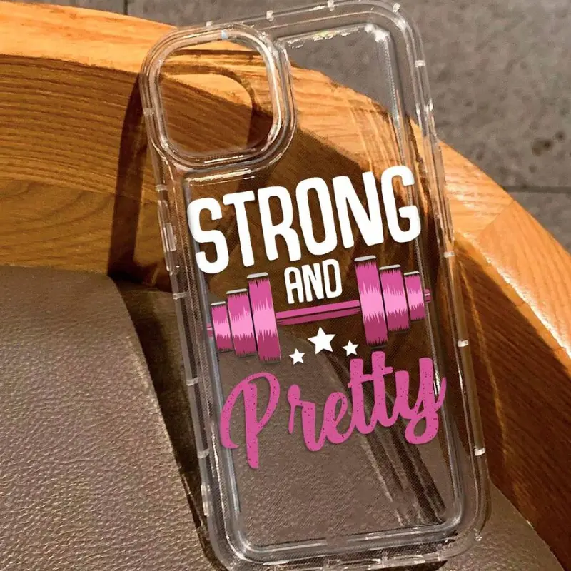
Strong and Pretty Phone Case
A short affirmation built like a compact logo: one bold headline, one contrasting script word and a simple barbell symbol.
View product details →Layered lettering: expressive before every line is read
The Jeremiah 29:11 God Has A Plan case takes the opposite route. Large black capitals stack across the center while pink script crosses over them. The verse reference sits above, and smaller supporting text appears near the bottom. The layered treatment creates motion and emphasis, but it is not designed for every word to have the same instant clarity.
Choose layered type when you like the energy of editorial lettering and are comfortable with the main phrase arriving in pieces. Contrast is doing careful work here: black provides structure, pink creates a second voice and the light case keeps both visible. Because the camera block occupies much of the upper corner, the main type starts lower and stays concentrated through the middle. On another phone model, always judge the final option shown for that model instead of assuming every camera opening produces the same balance.
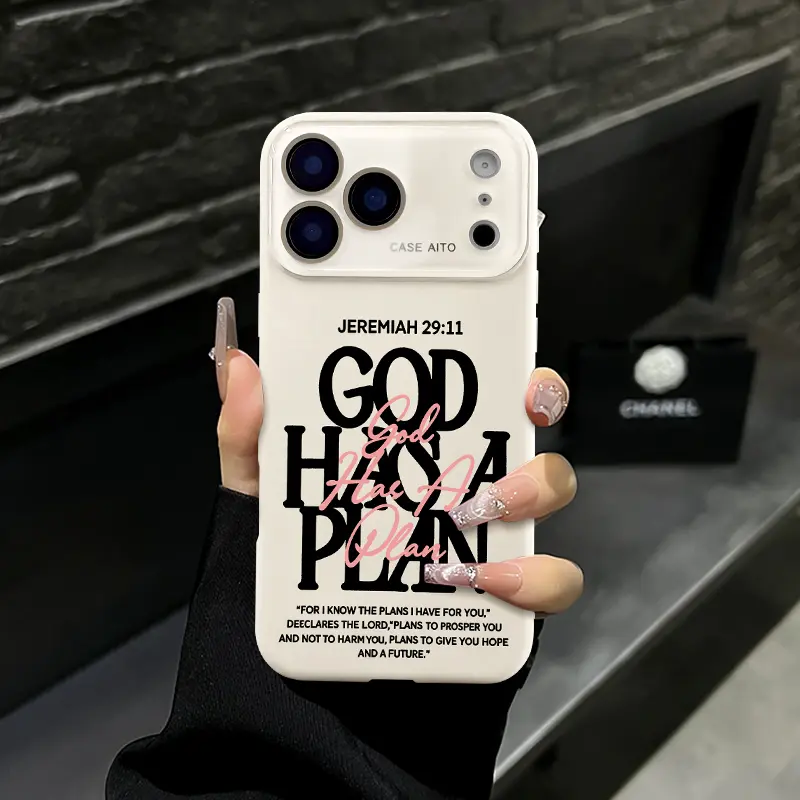
Jeremiah 29:11 God Has A Plan Phone Case
A scripture-led composition that uses overlapping display type, pink script and smaller verse text to create two reading distances.
View product details →Oversized wordmark: let one name carry the design
The Jesus Truth Road design is anchored by an oversized black “JESUS” running vertically. Smaller words cross the large letters with “the way, the truth, the life.” The scale makes the central name visible first, while the repeated line adds meaning without competing for equal attention. Solid red and taupe versions shown in the catalog image make the same black typography feel warmer or more neutral.
This format suits a message you want to state plainly. It also behaves more like streetwear typography than a framed quotation: large letters meet the edges, and the smaller phrase cuts across them like a label. If you wear graphic tees or carry a printed bag, compare scale rather than trying to match fonts. One oversized type piece usually sits more comfortably beside a small repeat than beside another equally dominant slogan.
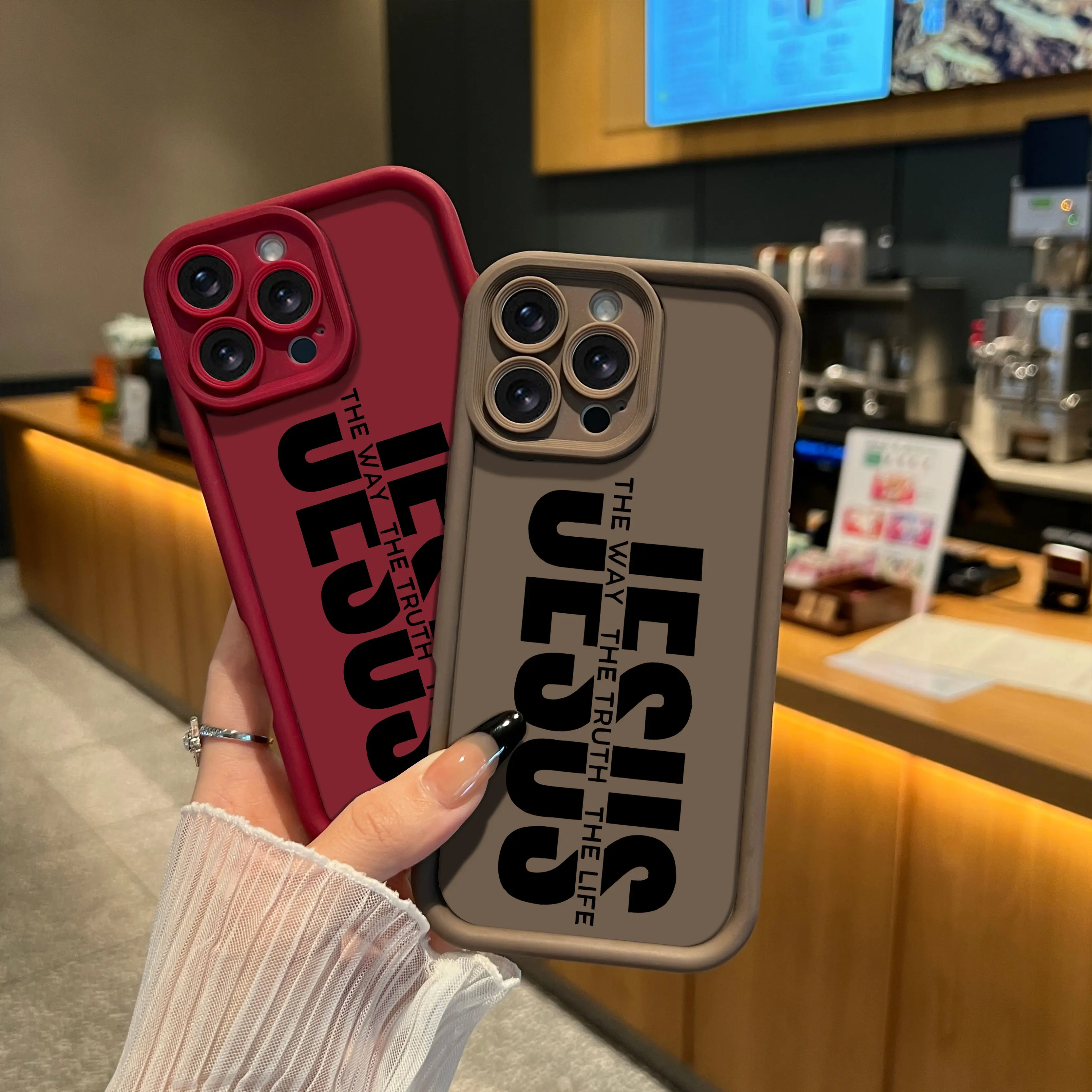
Jesus Truth Road Phone Case
A faith statement treated as a vertical wordmark, with a smaller repeated phrase creating a second layer of meaning.
View product details →Use contrast to decide, not color alone
A favorite color can attract you to a case, but contrast determines whether the message survives. White on a transparent ground can look clean when the phone underneath is dark enough; pink on black stays distinct; black on a mid-tone solid case feels graphic and firm. Product photography is the right place to study the intended relationship, while the selected model and color options tell you what can actually be ordered.
Think about your usual environment too. A low-contrast design can feel polished on a desk but disappear in a dim bag. A very bold black-and-white phrase will remain easy to find but may become the loudest accessory you carry. Neither result is automatically better. The useful question is whether you want the words to announce themselves or reveal themselves.
Match the message to your real voice
A quote case is unusually personal because other people can read it. Before choosing, say the words out loud. Consider whether you would be comfortable carrying them at work, at school, while traveling and in photographs. Faith-led designs are not generic decoration; the specific verse, name or statement should matter to the person using the case, especially when it is a gift.
For a gift, do not choose only from the recipient's favorite color. Confirm that the wording reflects something they actually say or believe. Then use visual tone as the second filter: sporty symbol, layered editorial type or oversized wordmark. Browse the CasePop Quotes & Meaning collection to compare more message-led designs, and open each product page to review current price, colors and supported phone models.
A five-second fitting test
Read the exact message. Look once from arm's length. Identify the first word. Check that the camera does not crowd it. Finally, place the product image beside a typical outfit or bag color. If the meaning, hierarchy and contrast all feel right, the case is doing more than printing a sentence on plastic; it is turning the sentence into an accessory.
The phone case pattern-scale guide explains how large and small elements share limited space. The statement-case styling guide gives a practical method for pairing a louder case with clothes and accessories. Those same principles apply to typography: decide what leads, give it room and let everything else support it.
The designer's conclusion
Choose a short headline-and-symbol case when speed and clarity matter. Choose layered lettering when you enjoy a more expressive composition that unfolds up close. Choose an oversized wordmark when one name or idea should lead without hesitation. A good quote phone case does not make every line shout; it gives the words a clear order and makes that order feel intentional.
Questions about quote phone cases
How do I choose a quote phone case?
Read the exact words first, then judge the design from arm's length. A useful quote phone case has a clear first line, enough contrast around the letters and a message you are comfortable carrying every day.
What makes words readable on a phone case?
Large letters, strong contrast and a clear type hierarchy improve the first read. Small supporting text can add detail, but the main idea should not depend on reading every line from a distance.
Should the quote match my outfit colors?
It does not need to match exactly. Repeating one color from the lettering or case edge is usually enough. Neutral clothing lets a bright message lead, while a quieter case can sit beside patterned clothes more easily.
Does the camera opening affect phone case lettering?
Yes. The camera occupies a large corner on many phone models. Check the product image and select the exact model on the product page so the main word or symbol is not visually crowded by the opening.