1. Let one color do the connecting
You do not need to match every color in a graphic case. Pick one: blue denim, a red sneaker, a silver ring or a black jacket. Repeating a single color makes the case look considered while keeping the outfit relaxed.
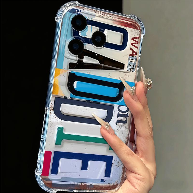
Distressed Color Block Baddie
Use one of its block-letter colors as the bridge to the rest of your look.
View this exact option →2. Use contrast when you want the case to lead
A detailed case reads best against a simple background. Black, cream, denim and a plain tote create breathing room for collage, gothic linework or statement type. If your outfit is already patterned, use a case with fewer colors but a strong silhouette.
3. Match the energy, not the exact motif
A retro case does not require a vintage costume. The useful link is mood: analog hardware with lived-in denim, dark florals with metal jewelry, playful typography with bright nails. The result feels personal instead of themed.
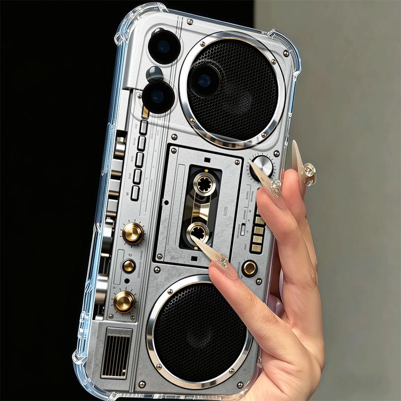
Vintage Silver Boombox
Chrome detail, cassette nostalgia and neutral color make this an easy retro accent.
View this exact option →4. Check fit before you fall for the artwork
Design comes first, but compatibility still matters. Open the CasePop product page, select your exact phone model and review the material, free-shipping and return details before checkout.
Try the three-object test
Put your phone beside the bag and jacket you actually use most days. Look for one repeated color or one repeated shape across those three objects. The case does not need to match both. A patch of red in the distressed Baddie design can echo a bag lining; the rectangular boombox graphic can connect with a boxy jacket even when the colors differ. If you are adding new accessories just to make the case work, try a simpler pairing first.
Then look from a few feet away. At that distance, small words and distressed details become blocks of color. Ask whether you enjoy that overall block, not just the close-up illustration. This is particularly useful when shopping from a large product photograph: the artwork will occupy a much smaller space in your hand.
Let one pattern lead
A busy case can sit comfortably with a patterned outfit, but one pattern should be easier to read. With wide stripes, choose a compact graphic that does not imitate their rhythm. With small checks, a single oversized motif creates a clearer contrast than another tiny repeat. Our pattern-scale guide walks through that difference with more examples.
When the statement should be personal
If you like the distressed plate look but want different lettering, the personalized license plate case is a separate $25 option. Enter your text, model and email; the studio sends a first proof within 24 hours after payment and prints after approval. The reference image shows the style, not your finished text. Read the plate-text guide before choosing a short name or initials.