The short answer: remove the fixed details first
To compare two phone cases at the same price, first make the model, selected color and live price identical; then choose between the artworks at thumbnail size, hand distance and close range. That order prevents a fit difference or a different product option from masquerading as a design preference.
The two CasePop examples below are both linked to the current iPhone 17 Pro Max · White · $8.88 USD catalog option. The exact links make the comparison fair at the time of this review. Read the selected words and current price again on the product page before adding either case to your bag, because availability and price can change.
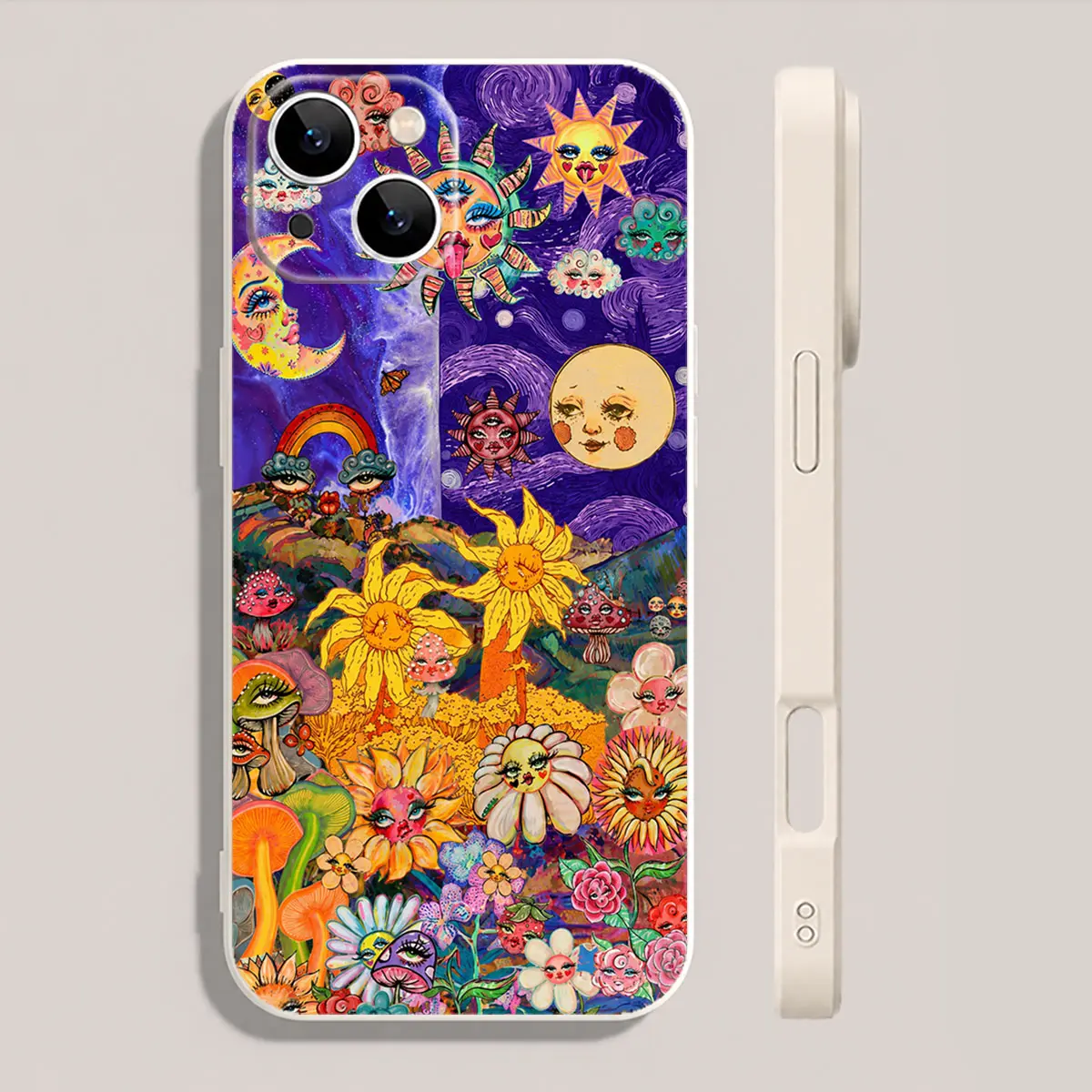
Whimsical Sun Moon Flower Face Phone Case
iPhone 17 Pro Max · White · $8.88 USDA dense illustrated composition with sun and moon faces, flowers, a rainbow and saturated purple, yellow, orange, green and blue areas.
View this exact option →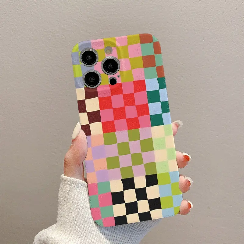
Color Block Pixel Grid Phone Case
iPhone 17 Pro Max · White · $8.88 USDAn edge-to-edge grid of small color blocks, including a black-and-cream checker section near the lower edge, with no single illustrated subject.
View this exact option →What the fixed details actually prove
Holding the model constant tells you that both links offer the same named phone option. Holding the catalog color constant removes one selector difference. Holding the observed price constant means price does not need to break the tie today. None of those facts says the artwork is equivalent, that the product photos depict exact physical dimensions, or that one case has better material or protective performance.
The word White is especially easy to misread. It is the current catalog option label for both links, but it does not describe every visible part of either design. The Sun Moon case reads as a saturated illustrated field. The Pixel Grid case reads as a sequence of colored squares. Use selector labels for ordering and use the image for the artwork; do not ask one to do the other's job.
Test one: look for the first thing your eye finds
Reduce each product image until it is about the size of a phone in your hand. On the Sun Moon design, faces and large yellow flowers create several recognizable subjects. Your eye can move between those subjects and discover smaller details later. On the Pixel Grid design, the repeated squares create an even rhythm. A few stronger color bands appear, but no illustrated character asks to be the main subject.
If you want a case that starts conversations about particular images, the illustrated option gives you named things to notice. If you want color to be the message, the grid gives color relationships more responsibility. This is not a contest between busy and simple: both images contain many colors. The difference is whether those colors build a scene or a system.
Test two: decide whether discovery or consistency matters more
Detailed illustration rewards repeated close viewing. You may notice a face, flower or small shape at a different moment. That can be appealing if you like objects that reveal themselves gradually. It can also feel visually demanding if you prefer one stable impression every time you reach for your phone.
A grid changes less as you move from close range to arm's length. Individual squares become a larger color field, so the overall rhythm remains easy to recognize. That consistency can suit someone who wants a graphic surface without one symbolic subject. The choice is personal, but the test is concrete: ask whether you want to keep finding details or keep seeing the same overall beat.
Test three: compare the case with what you already carry
Place the product images beside a screenshot or photo of the bag, jacket or desk item you use most often. Do not try to match every color. Instead, look for one visual connection. The illustrated case might connect through a warm yellow flower or a purple field. The grid might connect through repeated blocks, a checker detail or one stripe of color.
Then remove the reference item and look at the case by itself. If the choice only works when you construct a perfect outfit around it, it may be harder to enjoy every day. A good comparison should survive ordinary clothes, an ordinary desk and the quick glance you give your phone between tasks.
Use the camera opening as an interruption test
The camera area interrupts every case composition, but the product image is not a measuring tool for your exact device. Use it to judge the general relationship between the opening and the artwork. In an illustrated field, ask whether losing part of a small detail changes the scene. In a regular grid, ask whether the rhythm still feels balanced around the interruption.
For fit, return to the selector and match the complete phone name. Our iPhone model guide explains why the series number alone is not enough. For a deeper design comparison, the pattern-scale guide explains how focal motifs and repeated elements behave at phone size.
Read the product page in the same order for both choices
Open the first exact link and read the product name, selected model, selected color and current price. Repeat the same sequence on the second link. Compare the images only after those words match your intended purchase. Then review the current shipping information and return policy once, because those policies are part of the purchase decision even when the two items are priced alike.
Avoid using an unverified popularity signal, social post or enlarged image as a shortcut. This guide does not rank the two cases. It creates a cleaner decision by separating what is fixed from what is genuinely different.
A 30-second tie-breaker
Show both images to yourself for five seconds, hide them, and describe each in one sentence. If you remember the sun, moon and flowers, you are responding to illustrated subjects. If you remember a multicolor checker field, you are responding to rhythm and color structure. Open the exact product link for the description you would be happier to repeat.
Finally, confirm the model, color, price and availability one more time. Equal price makes the first comparison easier, but only the current product page can confirm the option you are about to order. The strongest choice is not the case with more detail or fewer details. It is the one whose visual logic you still prefer after the fixed shopping facts have been checked.
Questions about comparing phone cases
What should I compare when two phone cases cost the same?
First hold the phone model, selected catalog color and current price constant. Then compare what your eye notices first, whether the artwork has one focal subject or an even rhythm, and whether you still prefer it at normal phone size.
Does the same catalog color mean two phone cases will look alike?
No. A color label identifies a selectable product option, not the whole visual impression. Artwork can cover most of the case and make two options with the same color label look very different.
Can I use the product image to confirm phone-case fit?
Use the image to judge the artwork, but use the exact model selector to confirm the purchasable option. A catalog image alone is not proof that a case fits your device.
Should I choose the simpler phone case when I cannot decide?
Not automatically. Choose the design whose overall color block and visual rhythm still appeal to you when you stop inspecting tiny details. Simpler and more detailed artwork can both work when the choice is deliberate.