The short answer
For custom artwork, a clear phone case is best when transparency, the phone color or deliberate empty space belongs in the composition; a matte phone case is best when the image should read as one calm, continuous surface. Metallic glass adds another option: it can give bold, high-contrast graphics a luminous ground, but it is less neutral than either clear or matte. That is the useful definition behind the matte vs. clear phone case decision. Finish is not a final decoration added after the art. It changes the art's background, contrast and visual edges.
Start with the image, not the finish name
People often choose a case material the way they choose a wall paint sample: glossy sounds bright, matte sounds sophisticated and clear sounds simple. A better approach is to look at the image first. Is it a cutout pet portrait with a transparent background? A vacation photo that fills a rectangle? A black-and-white drawing? A monogram with plenty of open space? Each type asks the case to do a different job.
A transparent design needs a background even when the file does not contain one. On a clear case, that background is the phone. On a matte or metallic case, the finish supplies a more consistent field. Before uploading, note the color of the phone, the camera block and any visible magnetic ring. Those are not production details to hide later; they are shapes inside the final composition.
Clear hard polycarbonate: make negative space intentional
CasePop's Clear Hard Polycarbonate Case has a rigid, glossy back intended for detailed, edge-to-edge artwork. It is especially useful when a transparent PNG has a strong silhouette: a pet portrait, hand-drawn character, logo you own or a compact piece of lettering. The phone color can surround the subject like paper around an illustration.
The design risk is accidental emptiness. Thin pale lines can disappear against a light phone, while dark phones can change the mood of soft colors. Preview the actual phone color rather than imagining “clear” as white. If the artwork relies on a precise color field, add that background to the file or choose an opaque-looking finish instead.
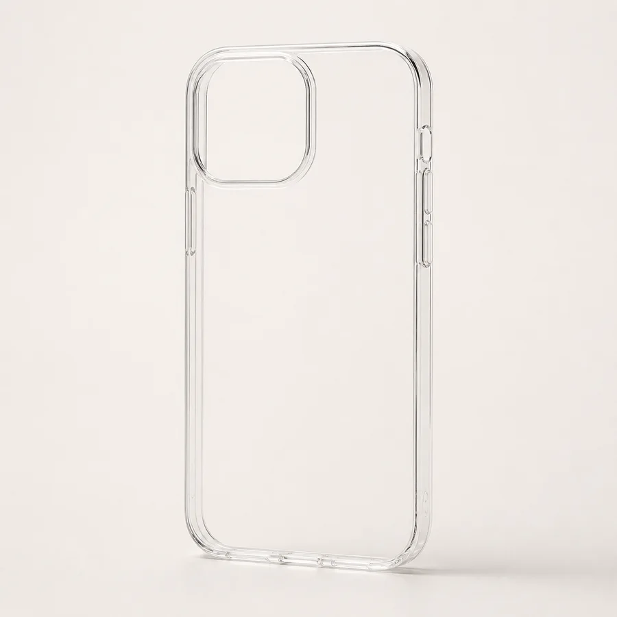
Clear Hard Polycarbonate
Use the phone color as part of the layout, and reserve transparent space deliberately around a strong subject.
Choose this finish →Clear MagSafe-compatible acrylic: design around the ring
A clear acrylic back with a flexible edge keeps the same open, layered feeling, but the built-in magnetic ring becomes a visible graphic element. That circle can help or hurt. A centered monogram may feel naturally anchored by it. A face, line of text or small pet portrait placed directly across the ring can look interrupted.
Treat the ring like a permanent shape on a poster. Place the main subject above it, build a circular composition around it, or use repeating artwork that does not depend on one uninterrupted focal point. The CasePop studio shows supported phone models and the selected finish before ordering; exact camera openings and edge details vary by model, so make the final placement decision in the preview rather than from a generic mockup.
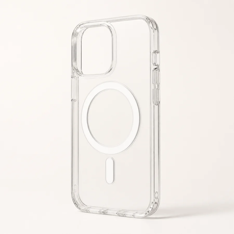
Clear Acrylic with MagSafe Compatibility
Let the magnetic circle become part of the geometry instead of allowing it to cross a face or key text.
Choose this finish →Matte AG glass: give detailed images a quieter ground
The MagSafe-Compatible Matte AG Glass Case uses an anti-glare matte glass back with a hybrid frame. Visually, its value is restraint. A low-shine surface does not compete as strongly with a full-bleed photograph, soft illustration or dense collage. Edges tend to feel less like separate stickers floating over the phone and more like parts of one finished panel.
Matte is not automatically the right answer for every subtle image. Very pale artwork can still need stronger contrast, and tiny low-contrast details are vulnerable on any small printed object. Check the image at roughly phone size. If the subject disappears when the preview is small, increase separation between subject and background before upload instead of expecting the finish to rescue it.
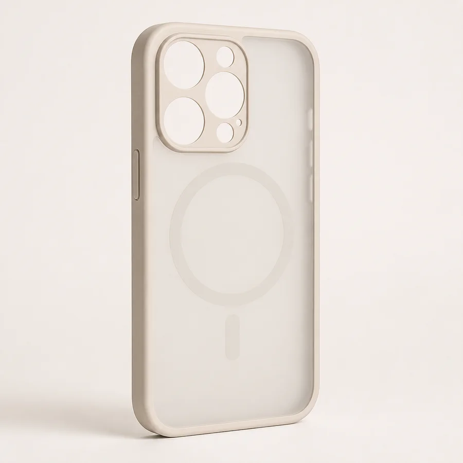
Matte AG Glass with MagSafe Compatibility
A useful ground for full-bleed photos, layered collages and illustrations that should read as one composed surface.
Choose this finish →Where metallic glass earns its place
Metallic glass is not simply a shinier matte option. The sheen adds a visual voice of its own, which makes it most convincing with artwork that can answer back: bold black linework, saturated shapes, a compact monogram or a graphic with clear light-dark separation. A delicate pastel photo may have to compete with the surface rather than benefit from it.
If the art already contains texture, glow or reflective cues, keep the layout simple. One large focal shape usually handles a luminous ground better than many tiny elements. For personal artwork, start with the largest original file and avoid screenshots or repeatedly downloaded social images. The CasePop photo-resolution guide explains why source quality and crop matter together.
A practical way to choose in five minutes
Open the image at phone size and identify the one detail that must survive: a pet's eyes, a face, a signature, a date or the outline of an illustration. Next, decide whether the phone color should be visible. If yes, begin with clear. If no, begin with matte. If the artwork is bold and would benefit from a visible sheen, compare metallic glass as a third direction.
Then check three fixed zones: the camera opening, the outer trim and, when present, the magnetic ring. Keep faces and words comfortably inside those boundaries. A background photograph can bleed beyond them; a small subject cannot. Use the custom artwork guide for transparent PNGs and original illustration, or the photo phone case guide for full-frame images. Both lead into the same CasePop Custom Studio, where you can compare the six current finish options and select the exact supported phone model.
The designer's conclusion
Choose clear when the empty space is part of the idea. Choose matte when the image needs a steady visual ground. Choose metallic only when its sheen strengthens the artwork rather than becoming a second subject. The strongest custom case is not the one with the most noticeable material description; it is the one where the material makes the focal point easier to see.
Questions about clear and matte custom cases
Is a matte or clear phone case better for custom artwork?
Choose clear when the phone color or transparent areas belong in the composition. Choose matte when you want a quieter, low-shine ground that helps a photo or illustration read as one finished panel.
Can a transparent PNG be printed on a clear phone case?
Yes. A transparent PNG is useful for isolated artwork because unprinted areas can reveal the phone beneath. Check the live preview and keep important details away from the camera opening and outer trim.
Will a MagSafe ring affect the design?
A visible magnetic ring becomes part of the composition on clear MagSafe-compatible cases. Place a subject above it, center a circular element around it, or choose a different finish if the ring interrupts the artwork.
Which case finish works best for a full-bleed photo?
A smooth opaque or low-shine back often gives a full-bleed photo the most visually continuous ground. Clear cases can also work when the image is intentionally cropped edge to edge, but transparent gaps will reveal the phone color.